designing an e-commerce website for my local Muslim youth sisters organization analyzing the usability of the starbucks app through user research and testing
This was a project for my Digital Media Page Layout class. The goal of this project was to create a poster for a fictional conference that used Gestalt principles and typographic hierarchy.
Sep 2020
Graphic Designer
Illustrator, InDesign
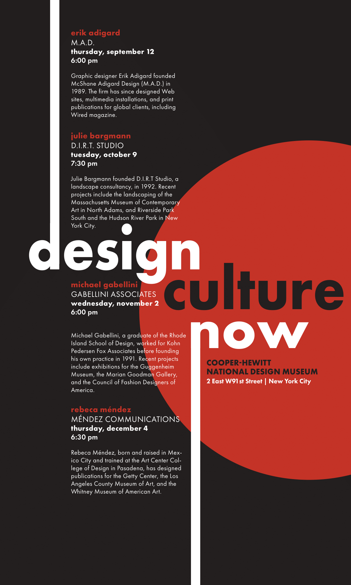
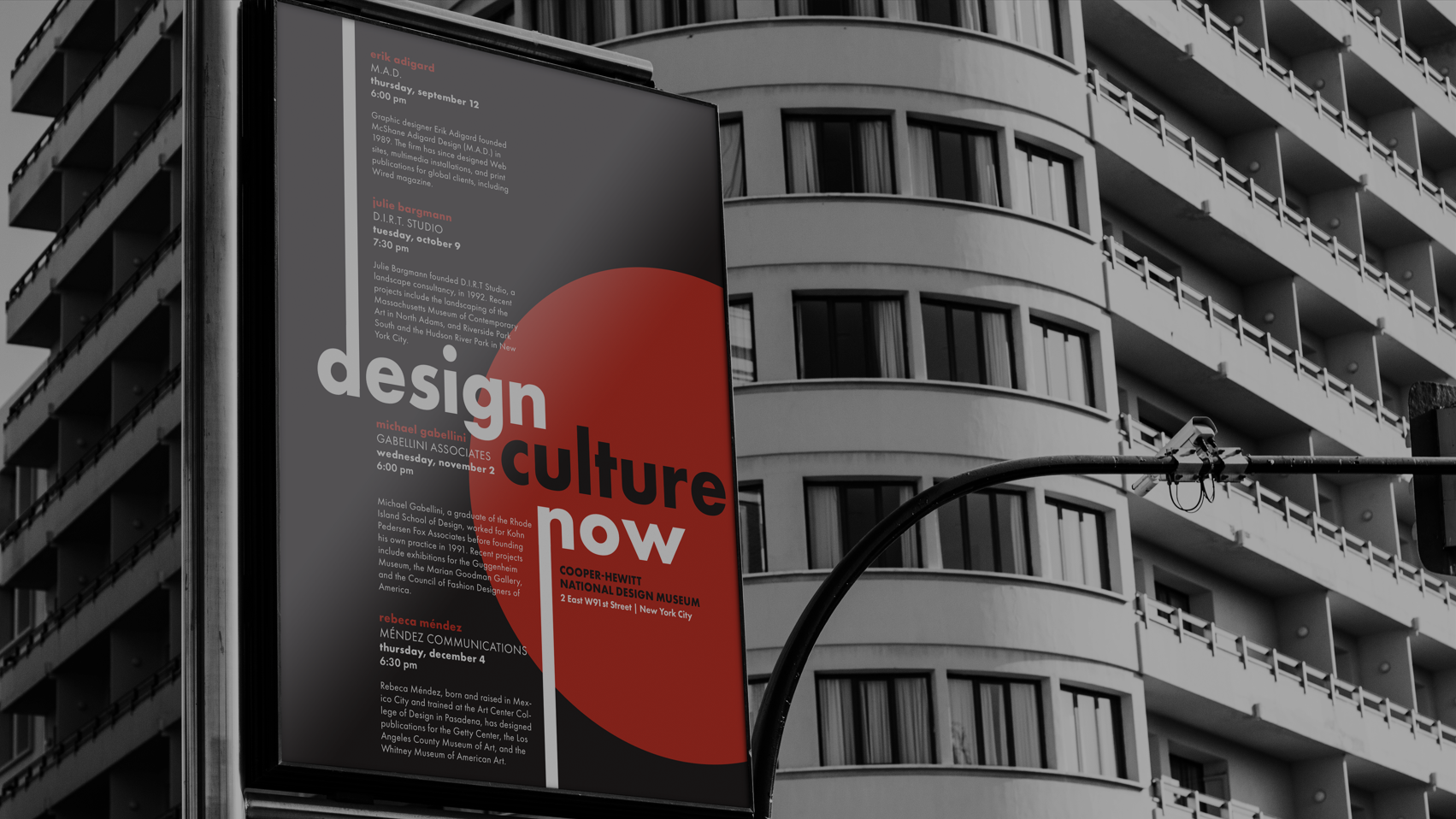
When brainstorming for this project, I started by thinking about what the phrase “Design Culture Now” meant to me. The words “collaborative”, “innovative”, and “diverse” came to mind quite often, since that is how design has evolved over time. Once I had those words, the next step was to figure out how to best represent them in my design. I wanted to create a design that was minimalist and would not look out of place in the Smithsonian museum. I also tried to avoid dated fonts to signify any particular time.

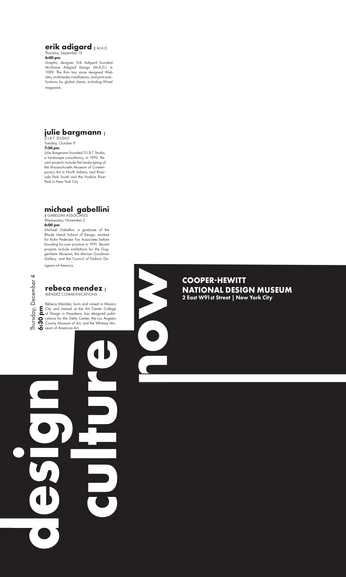
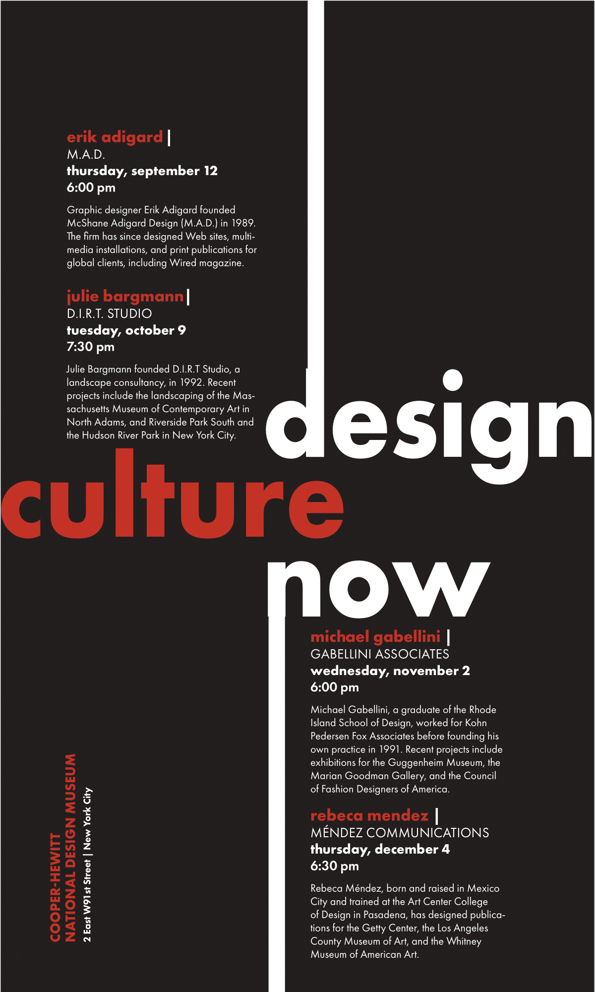
To execute this concept, I decided to use circles and rectangles, and a contrasting color palette of red and white to signify collaboration and diversity. To create a hierarchy, I thought about which pieces of information I found most important (speaker name and event date), bolded them, and changed the color of the speaker name to a bright red to emphasize. Combined with the alternating colors of the title, I was able to create not just a hierarchy but a repetitive pattern.
I also arranged the title in a “staircase” sequence to add continuity and imply a chronological progression of design culture. In terms of incorporating Gestalt principles, the proximity of the body copy to the title emphasized their relation to each other.